Wine Bar Near Empire State Building: Plan Your AYZA Visit
AYZA Wine & Chocolate Bar is a four minute walk from the Empire State Building. Here is the route, what...
Ayza Wine Bar NYC | Wine & Chocolate Bar in Midtown Manhattan


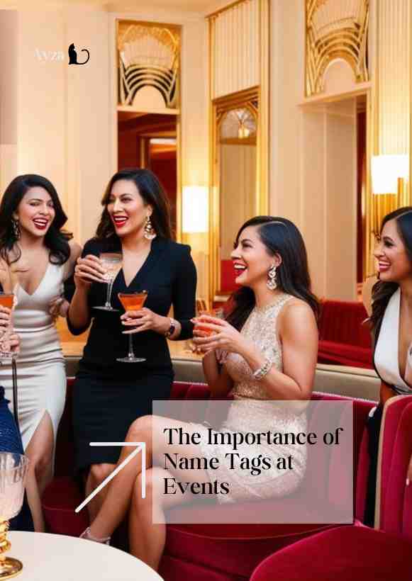
Event name tags are the smallest thing at an event and the one guests interact with for the longest. A badge nobody can read from conversational distance, or one that spins backwards on a lanyard all evening, quietly costs you the introductions the event exists to create. Getting them right takes twenty minutes of thought and no extra budget.
Quick answer: Print first names at 36 to 48 point, dark text on a plain light background, with the second line half the size. Use double clip badges or magnetic backs rather than single clips or lanyards. Set them out alphabetically on a table so guests collect their own. Print a blank stack for walk ins and bring a marker.
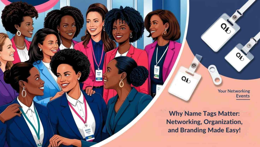
Start by deciding what the badge is for. If it exists so people can greet each other, the first name is the only thing that matters and everything else is competing with it. If it exists so people can find each other professionally, one line of context helps. It cannot do both equally well.
| Event type | Line 1, large | Line 2, half size |
|---|---|---|
| Team or social event | First name | Nothing, or team |
| Client or industry evening | First name | Company |
| Conference or association | First name | Surname and organisation |
| Alumni or reunion | First name | Year or cohort |
| Mixed guests and partners | First name | Nothing at all |
Two things to leave off. Job titles, which introduce hierarchy into a room that was probably trying to remove it, and anything that reveals a guest’s home city, phone number or personal details. A badge is a public document worn at chest height and photographed all evening.
Ask for preferred name on the RSVP rather than assuming. Somebody registered as Katherine may go by Kate, and a badge with the wrong name on it is worse than no badge.
The test is whether you can read it from about four feet without leaning in, because that is conversational distance and leaning in to read a chest is exactly what nobody wants to do.
Put the branding at the bottom. The name goes in the optical centre of the badge, and a logo across the top pushes it down into the area that gets obscured by clothing.
| Attachment | Good | Bad |
|---|---|---|
| Double clip | Stays flat and upright, works on most fabrics | Needs a lapel or a firm edge |
| Magnetic back | No holes, sits well on knitwear and dresses | Costs more, unsuitable near pacemakers, ask first |
| Single pin or clip | Cheapest | Rotates, tilts, puts holes in clothing |
| Lanyard | Quick to hand out, no fabric issues | Spins backwards, hangs too low to read |
| Adhesive label | Fine for a short informal event | Falls off, marks fabric, looks temporary |
If you use lanyards, choose double corded ones. A single cord is what makes a badge spin around to show its blank back, which is the most common badge failure at any event. Whatever you choose, offer an alternative at the check in table; someone will be wearing something a clip will damage.
Large type helps everyone, and a few more decisions widen that further. Use strong contrast rather than tone on tone, which is a problem for low vision guests and for anyone in a dim room. If you colour code by group, add a word or a shape as well, because colour alone excludes guests with colour vision deficiency.
Matte stock beats glossy, which reflects overhead light straight back at the person trying to read it. If your event has pronoun sharing as part of its culture, print them rather than asking people to write them on, and make it optional on the RSVP rather than mandatory. Some events add a small sticker system for conversation preference, which is genuinely useful at mixers, but only if you explain it clearly at check in.

QR codes on badges are useful for one thing: letting people exchange details without typing. They are a genuine risk if they encode anything more than that. Anyone can photograph a badge across a room and scan it later.
Three rules. The code should resolve to something the guest has explicitly agreed to share, never a raw email address or phone number. It should be opt in on the RSVP, not applied to everyone by default. And it should not double as an access credential, because a badge left on a table becomes an entry pass. If you are tracking attendance, scan a code the venue or organiser holds, not one on a guest’s chest.
Test every code on two phones before printing. A code that has been resized to fit a design and no longer scans is a common and entirely avoidable failure.
The badge design is only half of it. The other half is the ninety seconds at the door, which sets the tone for the whole evening.
Something will be wrong. Someone will bring a colleague, someone’s name will be misspelled, and someone will have changed their name since they registered. Plan for it rather than improvising.
Print ten to fifteen percent extra blanks in the same design and bring two good markers, black and broad. Handwrite in capitals and keep it large. Nobody minds a handwritten badge; everybody minds standing at a table while someone apologises about a printer. If a name is wrong, replace it immediately and dispose of the incorrect one rather than leaving it on the table.
Have a discreet way for a guest to ask for a different name without explaining why. A blank badge and a marker offered without a question is the whole solution.
Collect badges at the exit if they carry QR codes or anything else that should not leave with a stranger, and provide a bin for them so guests are not carrying them home in a pocket. Reusable holders and lanyards are worth collecting anyway; they last across several events and cut both cost and waste.
Keep the badge template with your event brief, along with what you learned. The list of names that were wrong is the most useful thing you will have, because it tells you exactly which RSVP field to change next time.
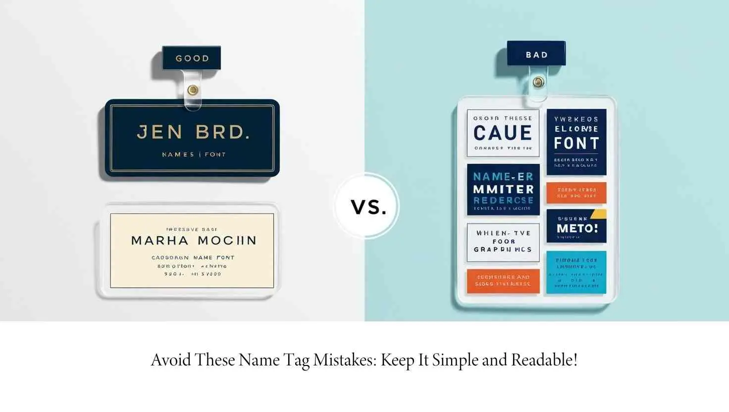
First names at 36 to 48 point, with any second line at about half that size. The test is whether you can read it from four feet away without leaning in.
The first name large, and at most one supporting line such as company, team or cohort. Leave off job titles and any personal contact details.
Double clip badges or magnetic backs stay flat and readable. Single clips rotate and single cord lanyards spin backwards, which is the most common badge failure.
Only if it is opt in, resolves to details the guest agreed to share, and is not used as an access credential. A badge can be photographed and scanned by anyone.
Ten to fifteen percent extra blanks in the same design, plus two broad black markers for walk ins, misspellings and name changes.
Large type, dark text on a plain light background, matte rather than glossy stock, and a word or shape alongside any colour coding so it does not rely on colour alone.
Event name tags are one detail among many, and the ones that matter most are the ones guests touch. If you are still choosing a room, private events at AYZA in Midtown start at $69 per person and hold up to 20 seated or 40 standing, with a check in area at the entrance.
Venue capacities and prices were checked against ayzanyc.com on September 9, 2026.